As I explained last novel update, artist Jordan Henderson and I went through much creative turmoil creating the cover for the forthcoming novel Much Ado About Corona. After many emails, sketches and brainstorms we finally settled on a concept where the antagonist of the story (a cop pushing the COVID agenda) is confronting the two protagonists (Vince and Stefanie) on a lockdown-deserted street.
Jordan soon got to work mixing colours in his Washington State studio. A few weeks later, he sent me a scanned copy of the work-in-progress:
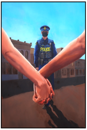
My immediate reaction was that this was an image of two people being arrested for public nudity by a masked cop near the border of Mexico.
“The more I look at the preliminary rendition, before we added all those changes, the more I dislike it,” Jordan later admitted to me.
Over all, it still needed chiseling, but held much promise. I quickly appreciated the accurate rendering of the Ontario Provincial Police uniform—except that in Ontario they’re not blue.
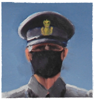
More so, I was particularly happy with how he depicted Constable Justin T. MacKenzie (AKA Constable Corona) himself. While he is the villain of the story, he’s not a “thug.” Just a sleep-deprived cop required to use law enforcement as some twisted way to keep people healthy. He reflects the awkwardness of the whole Canadian police state. In particular, I thought Jordan captured his internal ordeal in the way he depicted Constable Corona’s eyes:
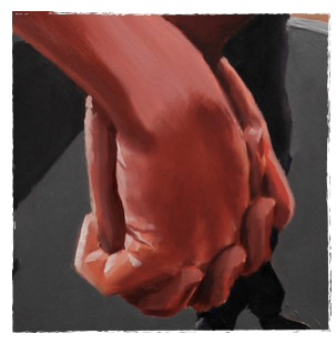
Likewise, the arms and hands of the two protagonists are skillfully rendered. I used to be a portrait artist (twenty years ago) so I know what it takes to so beautifully and accurately paint interlocking fingers like this:
The background in the painting, however, was set in an empty town square. To me it looked too much like a showdown from a wild west movie. Instead, I felt moving the three of them to an empty road, with the vanishing point behind Constable Mackenzie, would mirror the V-shape already created by the clasping hands. (And V is a recurring theme in the novel).
I also asked Jordan if he wouldn’t mind putting some short sleeves on those bare arms, so that they did not appear naked. Oh, and since the arm on the right (Vince) is one-quarter native Canadian, would he darken the skin a touch? And, then, lastly, if he could repaint Constable Corona’s uniform black.
Jordan quickly went ahead and employed his artistic skills to fashion a voodoo doll in my likeness, which he promptly drowned in a container of cadmium paint. By the time I was discharged from ICU, he had a second rendition ready:
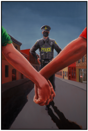
Now we were getting really close…
The added sleeves not only ended the protagonists’ membership with the local nudist colony, it also revealed gender and added some welcome colour. The arm on the left is Stefanie (an anti-masking baker), who is wearing just such a green dress in the opening chapter.
Constable Mackenzie, with his darkened uniform, now looked like a member of the Ontario Provincial Police.
And the main road of Moosehead (a fictional town in Northern Ontario) was (literally) heading in the right direction.
At this point, I knew we had found the right cover. Just a few more adjustments.…
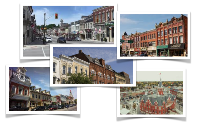
Jordan and I agreed the road was too narrow for a Canadian town. It looked more like it was set in Europe or Latin America. Also, the buildings were a little bland—almost like a movie set waiting for the CGI team to take over. I sent Jordan photos of my hometown of Stratford and my previous home of St. Marys, to give him ideas of how Ontario towns look:
So, Jordan pierced my voodoo doll with the tip of a paint brush (right through the liver) and went back to the easel for some final revisions. By the time I was out of post-op he had a new version waiting in my email box:
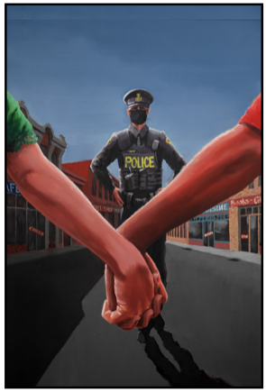
Now that looked like an Ontario town with signs and ornate rooftops. Granted the road is still a bit too narrow, but we had to work within the 6×9 dimensions of a novel. Making it wider would have filled the cover with pavement, arms and not many buildings:
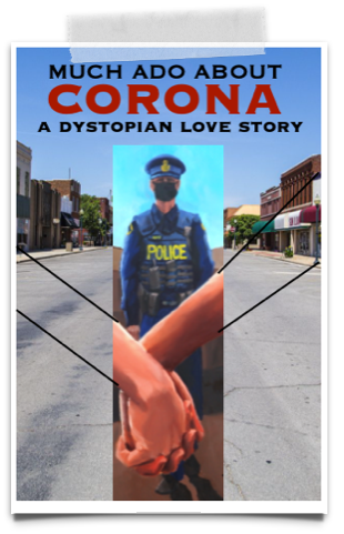
Between the vacant street and the closed signs, it’s obvious we are in lockdown. While such a summer scene doesn’t actually take place in the novel, all the individual elements are present over the course of the 113,000 word tale. I strongly feel that Jordan’s painting sums up the theme of Much Ado About Corona—a story about love and freedom opposing oppression and restriction.
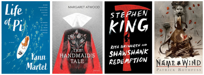
I feel very privileged to have had Jordan Henderson render this custom-made image. Yes, as two people have pointed out to me, painted covers are a bit out-of-style. Photoshopped covers is the fad right now. But, hey, I noticed Yam Martel, Margaret Atwood, Stephen King and Patrick Rothfuss all still use painted images (and last I heard they weren’t standing in any welfare lines):
Jordan is working on a royalty—so every time someone buys a copy of the novel they’ll be supporting his continued artivism as he produces more paintings exposing the corona hoax from renegade studio:
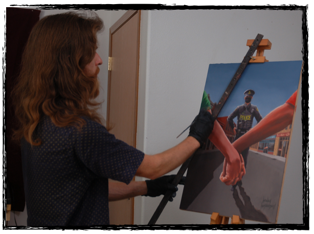
Jordan and I were so happy with the painting only containing Constable Corona, that we abandoned the idea of adding other figures—even though Jordan said he was keen on “flanking Mackenzie with syringe wielding doctors.”
The painting complete, next step was the design of the cover itself (i.e. title text and author’s name) While simpler than rendering the painting it was still a fair enterprise. I hired three designers to create multiple cover arrangements using Jordan’s painting. Next novel update, I’ll show you my top picks and let you vote on your favourite cover design.

 About the Author: John C. A. Manley is the author of the full-length novel, Much Ado About Corona: Dystopian Love Story. He is currently working on the sequel, Brave New Normal, while living in Stratford Ontario, with his wife Nicole and son Jonah. You can